Hoja
Content creators for the hungry.
- Brand Discovery
- Launch Project
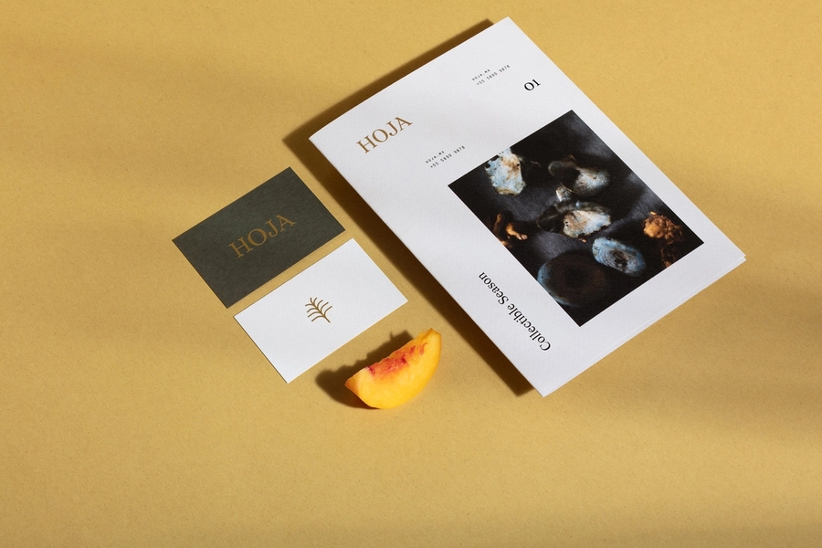
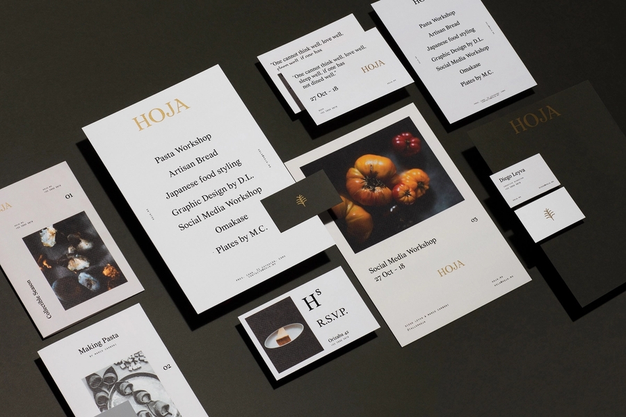
Brand identity for a gastronomy oriented creative agency.


Our design had to reflect sophisticated stability while creating dynamism by generating a series of different logotypes.
While reflecting brand values such as solidity and versatility, the designed elements must represent gourmet honesty.

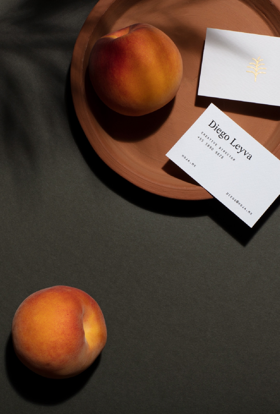

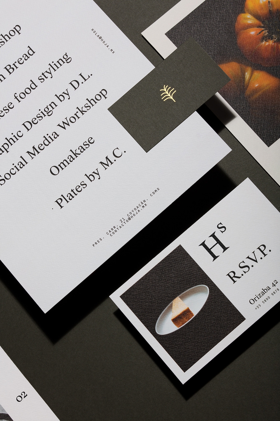

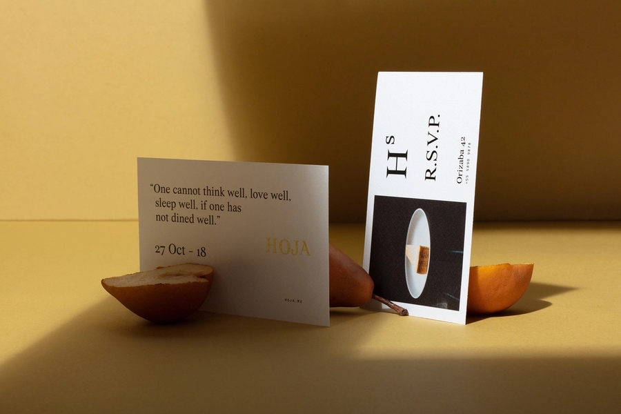

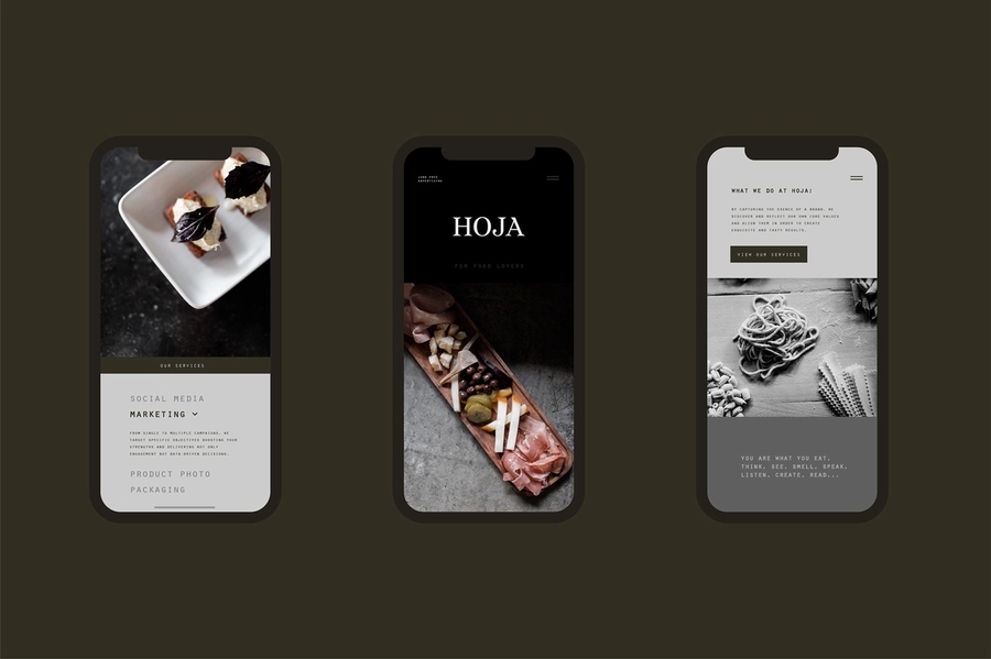

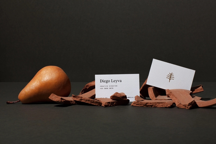
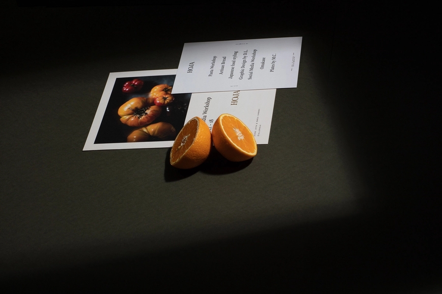
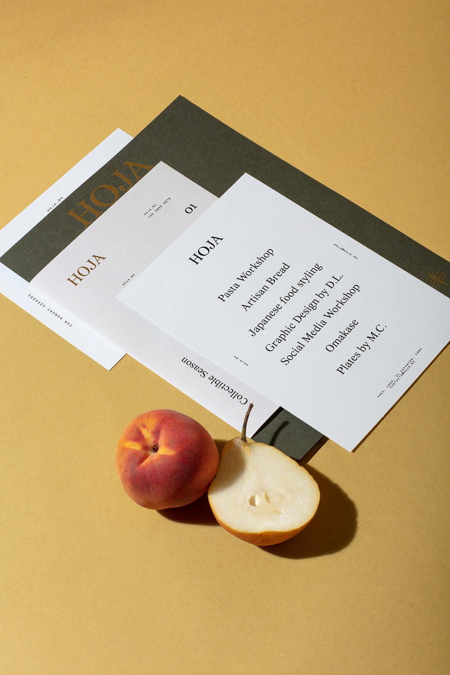
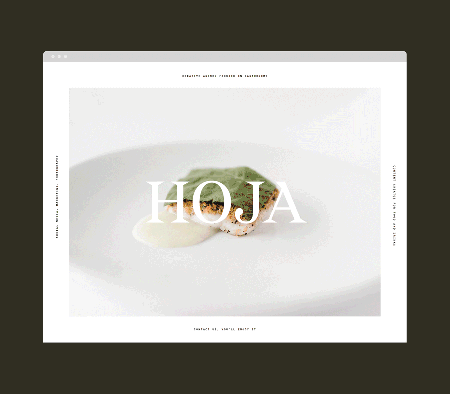
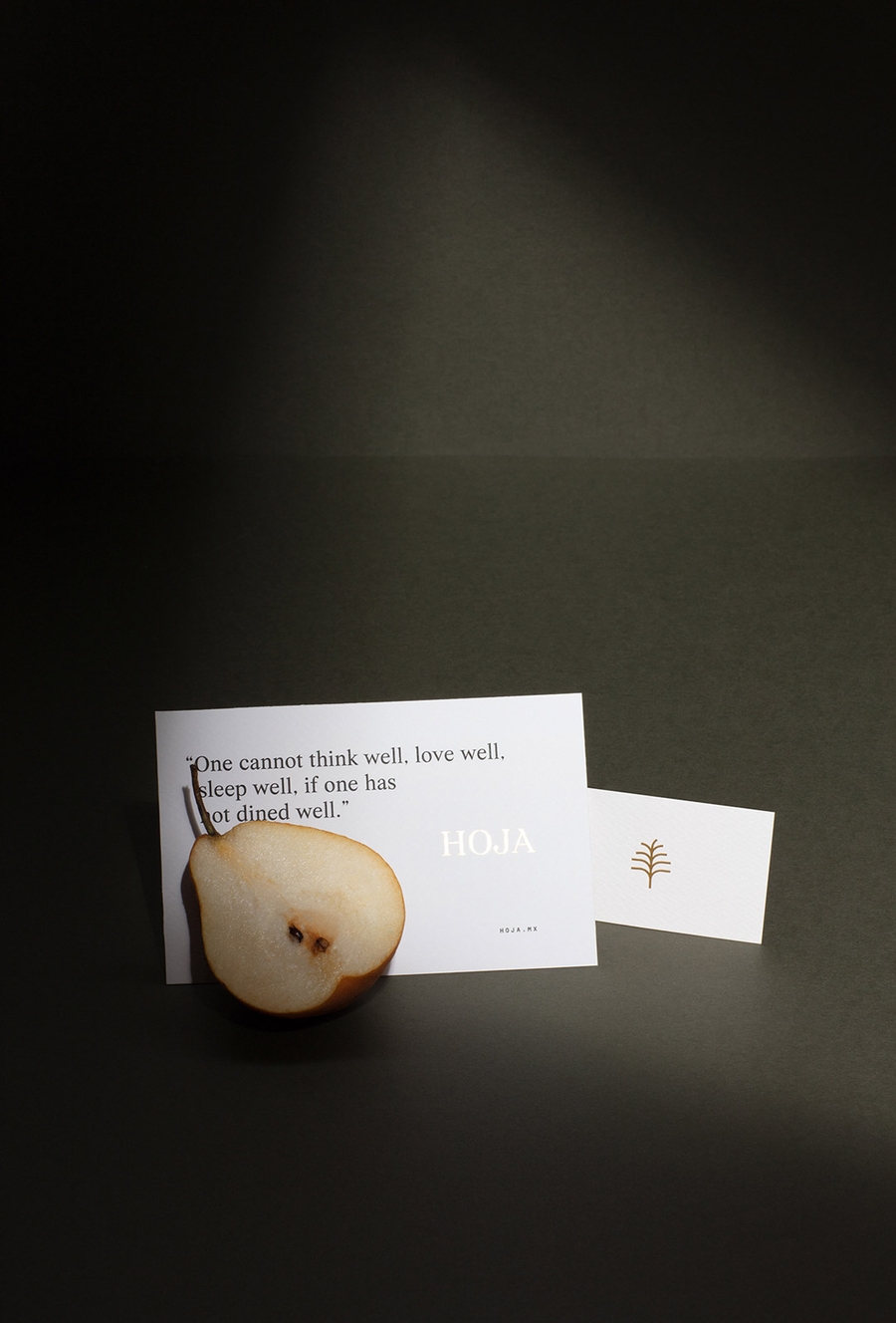
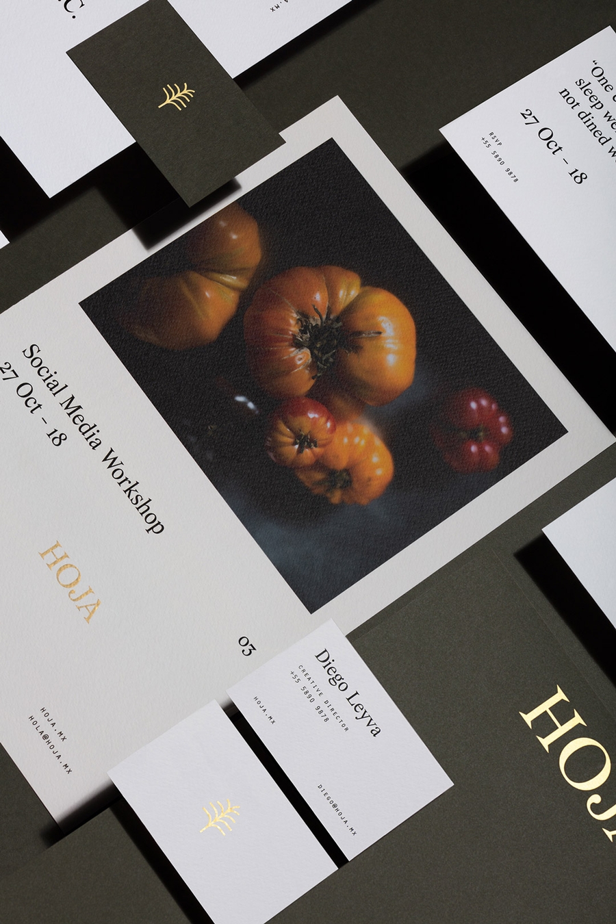
The project pointed to align brand identity, naming, website, photography and social media strategy around the company’s ideas and desires. Through a sophisticated use of a serif type, the brand displays a strong personality. The story of Hoja's branding comes from the different stages of a leaf, that way different logo versions where elaborated. A clean editorial grid and elegant foil details gave Hoja a contemporary baroque feeling.


Team
Diego Leyva
Design
Ana Georgina
Photography
Related Work

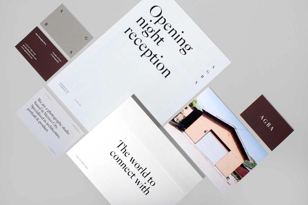
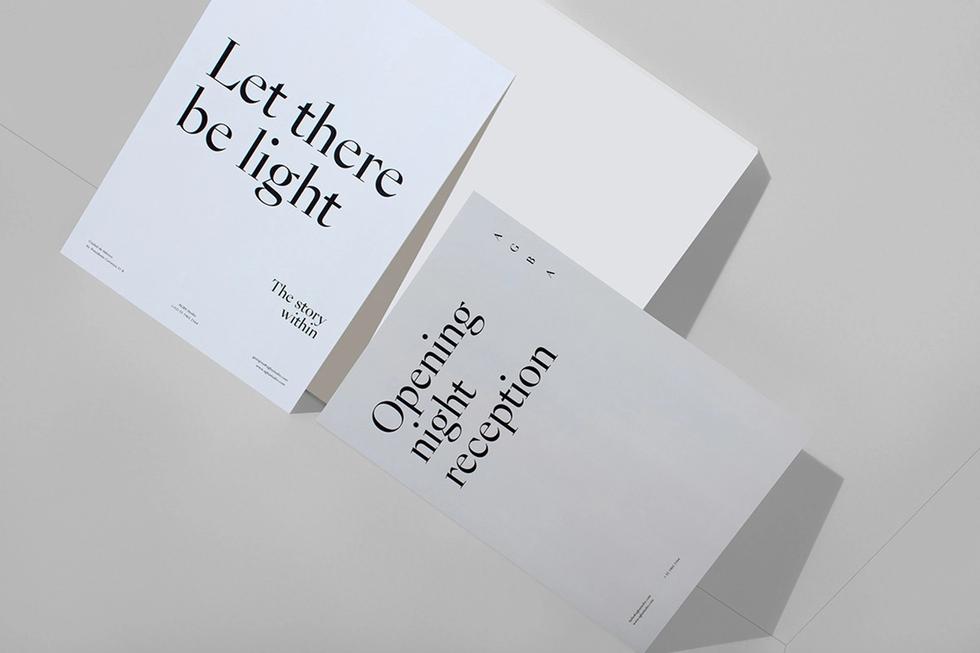
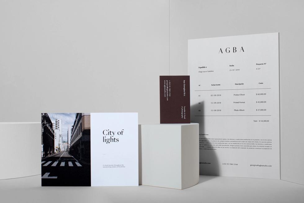
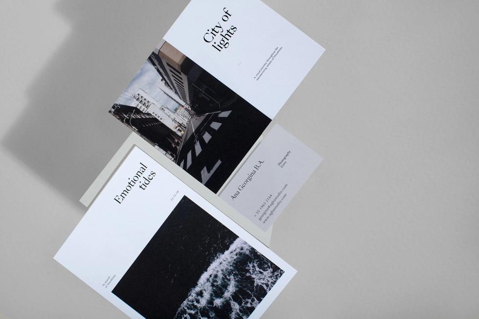
AGBA


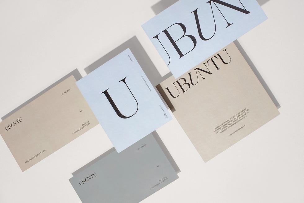
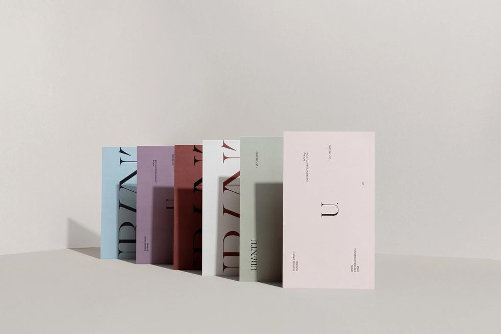

Ubuntu